Plotting Examples#
There are a variety of methods that can be used to visualize a network, which we demonstrate below. For most plots, NetworkX is used to create the structure of the network and matplotlib manages the drawing.
import pynucastro as pyna
The main plotting interface for a network is the plot method of RateCollection.
Tip
You can interactively zoom and pan a network’s visualization within Jupyter by installing the ipympl package and then adding:
%matplotlib widget
to the notebook (in a cell that is executed).
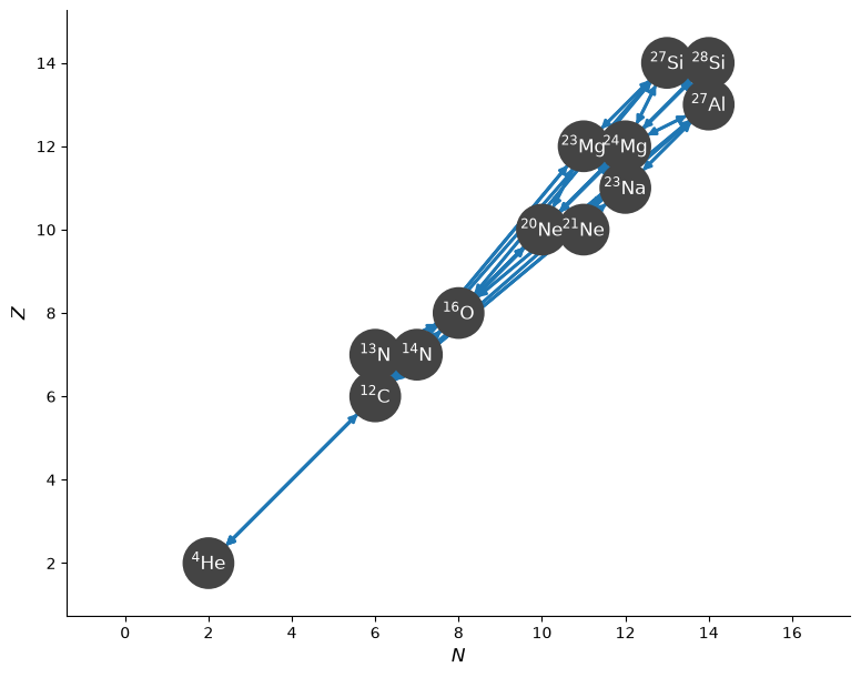
Standard view#
Let’s build a quick network that represents He, C, and O burning
library = pyna.ReacLibLibrary()
sub = library.linking_nuclei(["p", "n", "he4", "c12", "n13", "n14", "o16",
                              "ne20", "ne21", "na23", "mg23", "mg24", "al27",
                              "si27", "si28"])
rc = pyna.RateCollection(libraries=sub)
The standard network plot of this is:
fig = rc.plot()
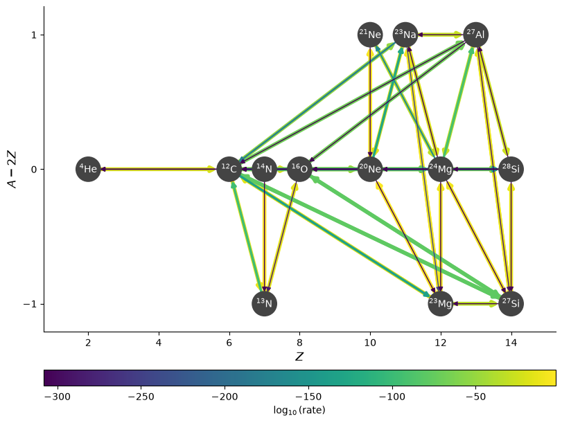
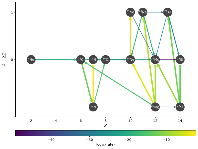
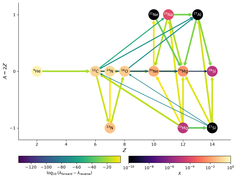
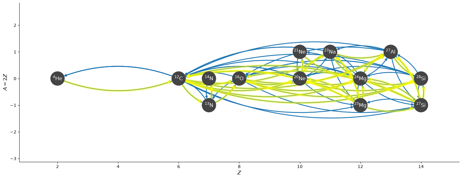
Rotated view#
Since everything lies close to the diagonal, it is hard to see the structure. We can instead look at a rotated view of the network.
While we’re at it, we’ll also color the rates by reaction rate strength by passing in the density, temperature,
and composition (as a Composition object.
rho = 1.e4
T = 1.e8
We’ll give the composition a lot of CNO + He
comp = pyna.Composition(rc.get_nuclei())
comp.set_all(1.e-10)
comp[pyna.Nucleus("he4")] = 0.5
comp[pyna.Nucleus("c12")] = 0.1
comp[pyna.Nucleus("o16")] = 0.075
comp[pyna.Nucleus("n13")] = 0.05
comp[pyna.Nucleus("n14")] = 0.15
comp[pyna.Nucleus("ne20")] = 0.02
comp[pyna.Nucleus("na23")] = 1.e-4
comp[pyna.Nucleus("mg23")] = 1.e-5
comp[pyna.Nucleus("mg24")] = 0.005
comp[pyna.Nucleus("si28")] = 1.e-5
comp.normalize()
fig = rc.plot(rho, T, comp, rotated=True,
              node_size=600, node_font_size=10)
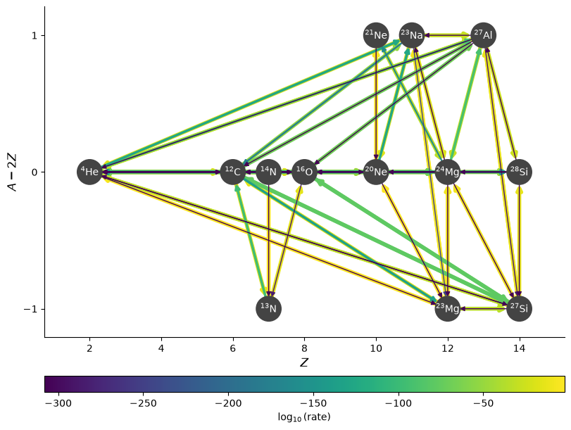
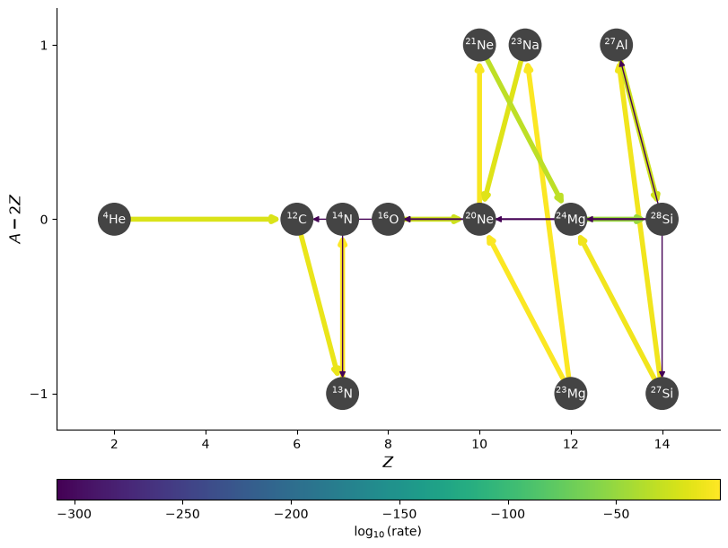
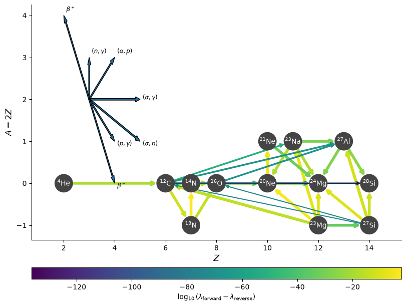
Showing \(p\) and \(\alpha\) links#
By default, we hide links connecting to protons and \(\alpha\) from rates like \((p,\gamma)\), or \((\alpha, \gamma)\) or other variations. You can turn these links back on by setting hide_xalpha=False (and similarly for protons, hide_xp=False).
fig = rc.plot(rho, T, comp, rotated=True, hide_xalpha=False,
              node_size=600, node_font_size=10)
Hiding unimportant rates#
We can omit edges from the plot for rates that are below a cutoff value, using ydot_cutoff_value:
fig = rc.plot(rho, T, comp, rotated=True,
              node_size=600, node_font_size=10,
              ydot_cutoff_value=1.e-50)
Sometimes, for a given nucleus, there are multiple rates that consume it, but one might be much more dominant than the others. We can set a threshold to old show the rates consuming a nucleus if they are within a desired factor of the fastest rate using consuming_rate_threshold:
fig = rc.plot(rho, T, comp, rotated=True,
              node_size=600, node_font_size=10,
              consuming_rate_threshold=0.1)
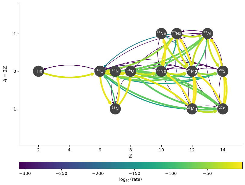
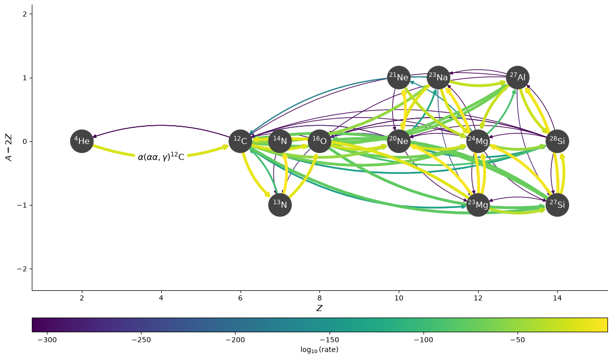
Curved edges#
We can also plot the edges curved, to help distinguish the forward and reverse rates.
fig = rc.plot(rho, T, comp, rotated=True,
              node_size=600, node_font_size=10,
              curved_edges=True)
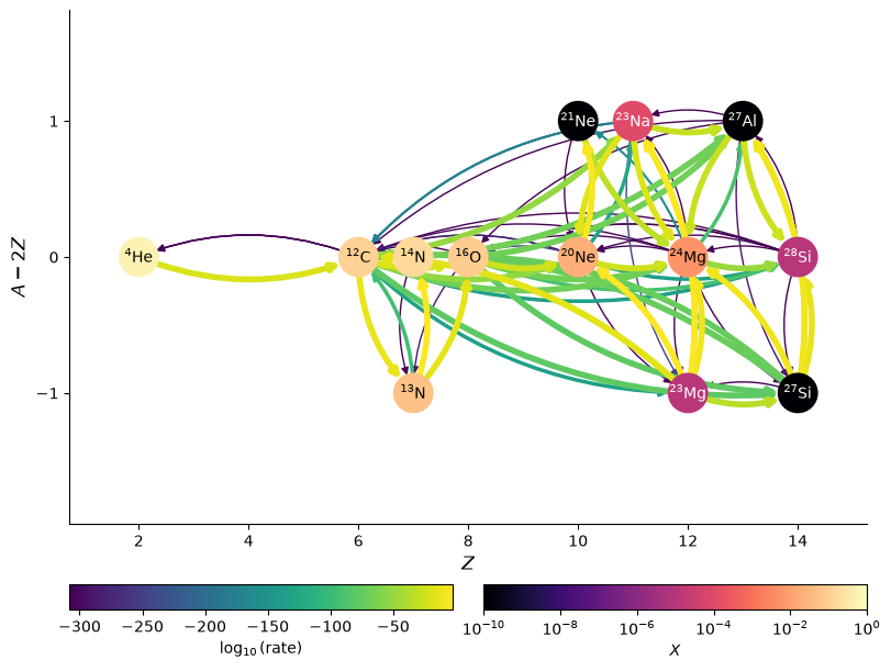
Showing abundances#
We can also color the nodes by abundance (mass fraction):
fig = rc.plot(rho, T, comp, rotated=True,
              color_nodes_by_abundance=True,
              curved_edges=True,
              node_size=600, node_font_size=10)
We can also display the edges as the net rate (forward - reverse) as a single directed edge using use_net_rate
fig = rc.plot(rho, T, comp, rotated=True,
              color_nodes_by_abundance=True,
              use_net_rate=True,
              node_size=600, node_font_size=10)
Legend and labels#
To help understand the different rate types, we can add a “compass rose” style legend that shows the directions of key captures. We specify the location in terms of (Z, N)
fig = rc.plot(rho, T, comp, rotated=True,
              node_size=600, node_font_size=10,
              use_net_rate=True, legend_coord=(3, 2))
Any edge can be labelled by passing a dictionary keyed by a tuple of the nodes in the network.
edge_labels = {(pyna.Nucleus("he4"), pyna.Nucleus("c12")):
               r"$\alpha(\alpha\alpha,\gamma){}^{12}\mathrm{C}$"}
fig = rc.plot(rho, T, comp, rotated=True,
              edge_labels=edge_labels, size=(1200, 700),
              curved_edges=True)
Filters#
We can use a rate filter, via rate_filter_function, to show only certain links. For example, to show only links involving proton capture, we can do:
fig = rc.plot(rho, T, comp, rotated=True,
              node_size=600, node_font_size=10,
              rate_filter_function=lambda r: pyna.Nucleus("p") in r.reactants)
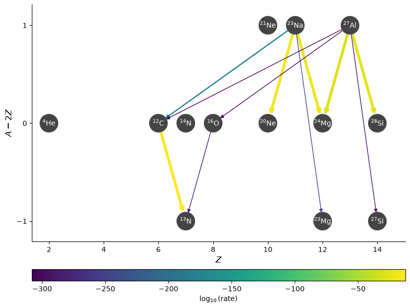
We can also highlight rates using the highlight_filter_function mechanism. This takes a function that operates on a rate and returns True if we wish to highlight the rate (i.e., as if we used a highlighter marker over the line).
Here’s an example where we highlight the rates that have \(Q > 0\)
fig = rc.plot(rotated=True, size=(1500, 600),
              highlight_filter_function=lambda r: r.Q > 0,
              curved_edges=True)
Plotting the Jacobian#
For implicit integration, we solve:
and the Jacobian, \({\bf J} = \partial {\bf f} / \partial {\bf Y}\) plays an important role in solving for the update.
We can visualize the Jacobian of our network easily using plot_jacobian.
Note
By default, we will show all elements where
but this ratio can be set via the rate_scaling keyword argument.
rho = 1.e4
T = 2.e9
comp.set_equal()
fig = rc.plot_jacobian(rho, T, comp, rate_scaling=1.e10)
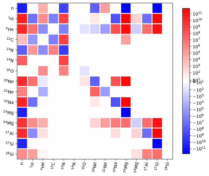
Warning
If you set rate_scaling too large, then roundoff error in mapping the Jacobian elements to colors can cause elements that are zero to appear colored. It is best to stay below 1.e15 to minimize roundoff.
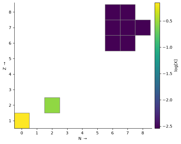
Plot nuclides on a grid#
Nuclides in a network may also be visualized as cells on a grid of Z vs. N, colored by some quantity. This can be more interpretable for large networks. This type of plot is enabled via gridplot.
Calling gridplot without any arguments will just plot the grid—to see anything interesting we need to supply some conditions. Here is a plot of nuclide mass fraction on a log scale, with a 36 square inch figure:
rate_names = ["c12(p,g)n13",
              "c13(p,g)n14",
              "n13(,)c13",
              "n13(p,g)o14",
              "n14(p,g)o15",
              "n15(p,a)c12",
              "o14(,)n14",
              "o15(,)n15"]
rates = library.get_rate_by_name(rate_names)
rc = pyna.RateCollection(rates=rates)
rho = 1.e4
T = 1.e8
comp = pyna.Composition(rc.get_nuclei())
comp.set_solar_like()
fig = rc.gridplot(comp=comp, color_field="X", scale="log", area=36)
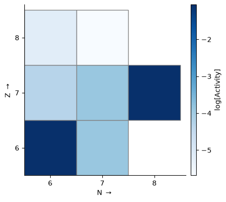
The plot is configurable through a large number of keyword arguments. Here we want to look at the rates at which nuclides are being created or destroyed, so we color by \(\dot{Y}\), the rate of change of molar abundance. Density and temperature need to be supplied to evaluate the rates. A full list of valid keyword arguments can be found in the API documentation.
fig = rc.gridplot(comp=comp, rho=rho, T=T, color_field="ydot", area=36,
                  cmap="RdGy", cbar_bounds=(-0.1, 0.1))

Unlike the network plot, this won’t omit hydrogen and helium by default. To just look at the heavier nuclides, we can define a function to filter by proton number. Here we also plot activity, which is the sum of all rates contributions to Ydot ignoring the sign.
ff = lambda nuc: nuc.Z > 2
fig = rc.gridplot(comp=comp, rho=rho, T=T, color_field="activity", scale="log",
                  filter_function=ff, area=20, cmap="Blues")
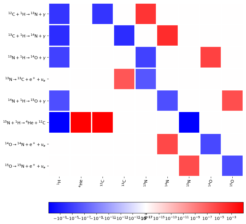
Network chart#
A network chart shows how each rate affects each nucleus. This is produced using plot_network_chart.
fig = rc.plot_network_chart(rho, T, comp)